Is possible to get different CSS color of selected strings in docs since as now it is (almost) as unreadable?

 Full res.
|
|
Aug '17 |
8 |
467 |
0 |
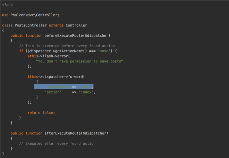
I am talking about website itself. Like this link: try to select some rows (like strings/quoted values, could be keys of assoc arrays) and it will be clearer.
Further explanation: when I try to follow advises and recommendation from docs if I copy part of code (like in image above), it is almost impossible to double check what's been copied.
It is small change of one CSS class but lot of help for new users (eyes).
Edit:
Even integers' color in code are not well readable.
Those are .hljs-number and .hljs-string classes in darcula.min.css.
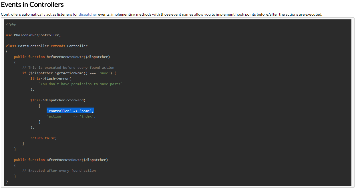
On my desktop the selected part becomes darkblue and text white which has good contrast and is in no way as bad as in the image you posted. This might be a setting on your system and is mostl ikely system related.
Sorry, i missed docs on title.
I'm using Chrome and that normal like that:

I am talking about website itself. Like this link: try to select some rows (like strings/quoted values, could be keys of assoc arrays) and it will be clearer.
Further explanation: when I try to follow advises and recommendation from docs if I copy part of code (like in image above), it is almost impossible to double check what's been copied.
It is small change of one CSS class but lot of help for new users (eyes).
Edit:
Even integers' color in code are not well readable. Those are
.hljs-numberand.hljs-stringclasses in darcula.min.css.
Sorry, i missed docs on title.
I'm using Chrome and that normal like that:
I am talking about website itself. Like this link: try to select some rows (like strings/quoted values, could be keys of assoc arrays) and it will be clearer.
Further explanation: when I try to follow advises and recommendation from docs if I copy part of code (like in image above), it is almost impossible to double check what's been copied.
It is small change of one CSS class but lot of help for new users (eyes).
Edit:
Even integers' color in code are not well readable. Those are
.hljs-numberand.hljs-stringclasses in darcula.min.css.
This is also how i see it in Chrome
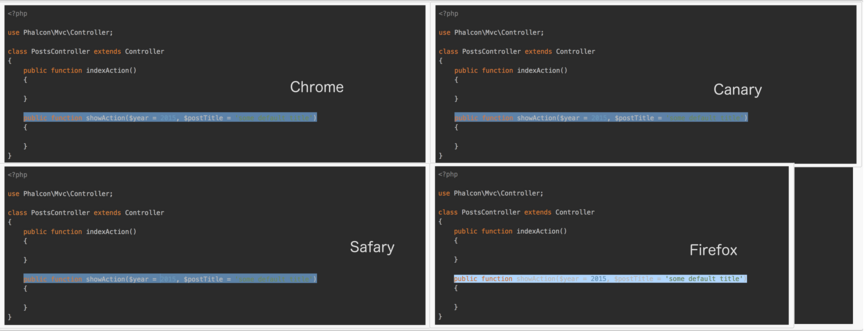
I see. Hm, something is not quite well here then. Wouldn't expect it. Btw, I am using macOS Sierra 10.12.6 version. Chrome and Canary give preview like in my images, while Firefox gaves me different one (but not so readable as yourselves). Maybe more readable but with some other similar issues. It could be on OS/Browser (both are latest versions) level, maybe?
This is how I see it through different browsers:

At least I would like to know if anyone experienced something similar because you two have readable preview there.
Firefox displays everything ok. time to use the diagnostics in your Web browser.
1/ A CSS file might not load. In the Firefox debug stuff, you can see a list of download files. Have a look at the equivalent in your Web browser.
2/ If all the files loaded, open up the CSS inheritance debug. In Firebug, this is displayed by right clicking the element and choosing Inspect Element. Your browser might choose a different CSS rule or default.
fitefox uses https://docs.phalcon.io/css/docs.3.2.css line 481
pre { overflow: auto; padding: 6px 10px; border: 1px solid #cccccc; border-radius: 3px; background-color: #f8f8f8; font-size: 13px; line-height: 19px; }
Perhaps Apple decided to change their free browsers to be ugly so they can force you into upgrading to the new release of OSX. You might have to buy CSS files from iTunes. :-))))))
Clearly, your OS / browsers are fucked up somehow. We've seen it with clients who think of Internet = Apple/Mac/Safari. All kind of odd bugs we had only with such users. Only worse was with M$ IE 6-8.
I see. Hm, something is not quite well here then. Wouldn't expect it. Btw, I am using macOS Sierra 10.12.6 version. Chrome and Canary give preview like in my images, while Firefox gaves me different one (but not so readable as yourselves). Maybe more readable but with some other similar issues. It could be on OS/Browser (both are latest versions) level, maybe?
This is how I see it through different browsers:
At least I would like to know if anyone experienced something similar because you two have readable preview there.